“There are only patterns, patterns on top of patterns, patterns that affect other patterns. Patterns hidden by patterns. Patterns within patterns. If you watch close, history does nothing but repeat itself.” This quote comes from author Chuck Palahniuk’s novel Survivor, but it’s also a perfect summation of the world of user interfaces.
User Interface patterns (UI) are common best practices that serve as a reusable solution to a frequently occurring problems. Over time, users acclimate to these patterns and can even grow to expect them. Herein lies the issue. If a pattern becomes ubiquitous with a certain task, the user experience can be hindered if the pattern is not present or a suitable replacement is not offered.
As user experience designers, we need to keep up with these trends and patterns. However, it is not enough to just recognize and utilize them, but we must also understand the implications associated as well.
In this post, we will explore the following common UI patterns for further examples:
- Input – Inline validation
- Navigation – Infinite scroll
- Content management – Hover controls
- Data management – Draggable objects
1. Input – Inline validation
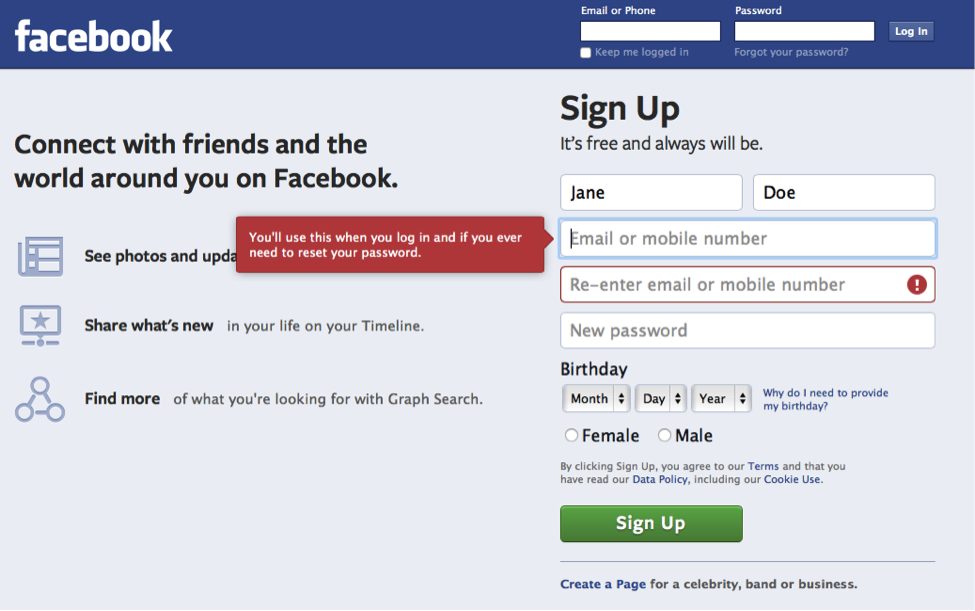
Inline validation is when information is entered by the user, typically into a form field, is inspected and validated before the user hits the call-to-action button. The user receives immediate feedback if her input is incorrect before she moves on to the next field.
Take a look at the Facebook sign up form below. Jane missed the required email input field. But lucky for her, she did not have to hit the “sign up” button before noticing her mistake. Instead, Facebook stopped her right away so that she knew exactly where and why the error occurred. Facebook not only flagged the error, but provided helpful text explaining why the field is important and beneficial to the user.

When forms are validated in real-time, it allows users to complete the task quickly, with less effort, and fewer errors. The combination of these three elements results in greater overall user satisfaction.
2. Navigation – Infinite Scroll
Infinite scroll is when more content automatically loads as the user reaches the bottom of a page. Think Pinterest, Twitter, or Google images.
There is less effort and precision required to scroll than there is to click. An infinite scroll is also a great mechanism for retaining user attention because there is less distracting navigation. Infinite scroll is an extremely useful UI pattern when there is a lot of content to present, like social media sites or search results.
The presence of this UI pattern on some of the largest and most popular websites increases the likelihood that the majority of users have knowledge of the pattern’s existence. When that knowledge exists, and the user has a navigational expectation, a site that utilizes pagination instead can feel laborious in comparison.
3. Content Management – Hover Controls
Clean, simple, and sleek are great descriptors of popular websites today. A clean and simple interface can easily be bogged down and cluttered by a plethora of controls that take away from the content itself. Enter, hover controls. These are content specific controls that appear only when needed (think Harry Potter’s Room of Requirement).
Hover controls are not only utilized to minimize page clutter, but they also help clarify implications of given actions. A user knows with great certainty that if she clicks the “send” button on the photo below, the action will only pertain to the content in the hover state. Here, the user experience is more powerful because ambiguity is decreased and therefore sets the user at ease.


4. Data Management – Draggable Objects
Allowing objects on an interface to be manipulated and rearranged by dragging is a popular interface pattern because it is easy to understand and visually mimics how a user conceptualizes organization.
You may be thinking this feels more like an interaction than a UI pattern but that is where you’re wrong. The UI pattern here provides visual feedback to support the interaction.
For example, when you click and hold on a radio station in iTunes Radio the image grows in size and the opacity of the object changes slightly. This indicates that the state of the object has changed and can be further manipulated. The user then gets another clue as she explores the interaction. When she drags the image slightly in one direction, the objects around it animates and shifts based on the location of the mouse. These slight animations and UI changes, clue the user into the interaction.

There is no need for a tutorial. This is a common and expected UI pattern that many users will pick up quickly or even come to expect. The UI patterns support and enhance complex interactions
While these are but four UI patterns demonstrating the importance of repetition and expectation to user experience, the digital world is chuck full of endless examples. Keep exploring and identifying these patterns and then utilize them appropriately in your designs. Remember, the world is made up of patterns and it your job to make sense of them.
Learn More about UX Design at General Assembly